Ultramarine and phthalo blue are two of the most popular blue pigments used by artists worldwide. Both boasting unique characteristics and rich histories, these pigments have found their way into countless masterpieces and continue to be favored by many artists today. Despite their shared status as blue pigments, ultramarine and phthalo blue possess distinct properties that set them apart and make them suitable for different applications and techniques.
Ultramarine vs Phthalo Blue
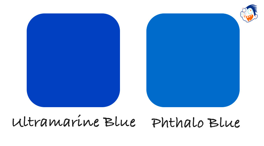
The purpose of this article is to delve into the fascinating world of ultramarine and phthalo blue, comparing their properties and discussing their various applications in art. By understanding the differences and similarities between these two remarkable pigments, artists can make informed decisions when choosing the ideal blue for their projects and better harness the potential of these vibrant colors in their work.
Origins and History
Ultramarine
Historical background
Ultramarine, with roots dating back to the 6th century, was first used in ancient Afghanistan for various artifacts and religious art. Imported to Europe from Asia, its name, derived from the Latin “ultramarinus,” means “beyond the sea.” The pigment was highly prized during the Renaissance for its vivid hue and scarcity, often valued more than gold. Renowned artists like Michelangelo and Titian favored ultramarine for its unparalleled depth and richness.
Extraction from lapis lazuli and synthetic production
Natural ultramarine comes from the semi-precious stone lapis lazuli, mainly found in Afghanistan. The extraction process involves grinding the stone into powder, washing it to remove impurities, and separating the pigment through multiple steps. Due to its labor-intensive nature and rarity, natural ultramarine was historically expensive. However, the 19th-century development of synthetic “French ultramarine” made the pigment more accessible and affordable for artists.
Phthalo Blue
Historical background
- Phthalo blue, or phthalocyanine blue, is a relatively modern pigment compared to ultramarine. Discovered in 1935 during a chemical research project, it quickly gained popularity for its vibrant hue, impressive tinting strength, and excellent lightfastness. Today, phthalo blue is widely used by artists across various mediums due to its versatility and affordability.
- Development and chemical synthesis Phthalo blue is a synthetic pigment created through a chemical reaction involving phthalocyanine, a large, stable, and highly chromatic organic compound. The production process results in a pigment that boasts a strong and intense color, as well as excellent lightfastness and durability. These characteristics have made phthalo blue a popular choice among artists who seek a reliable, vibrant, and cost-effective blue pigment for their work.
Color Characteristics and Properties
Ultramarine
- Color profile: Ultramarine exhibits a deep, rich blue hue with a slight reddish undertone. Its color leans towards the warmer side of the blue spectrum, making it ideal for creating shadows and cooler tones when mixed with other colors.
- Transparency and tinting strength: Ultramarine is a moderately transparent pigment, allowing for subtle glazing techniques and layering in artwork. Its tinting strength is moderate, meaning that a small amount can be used to create lighter tints when mixed with white or other colors without overpowering them.
- Lightfastness and permanence: Ultramarine has excellent lightfastness, meaning it is resistant to fading when exposed to light over time. This characteristic, combined with its good permanence, ensures that ultramarine-based artworks maintain their vibrancy and color integrity for years to come.
Phthalo Blue
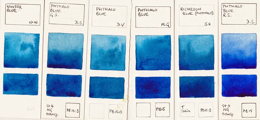
- Color profile: Phthalo blue has a bright, intense blue hue with a slight greenish undertone. It falls on the cooler side of the blue spectrum, making it an excellent choice for creating vibrant and bold colors in artwork.
- Transparency and tinting strength: Phthalo blue is a highly transparent pigment, offering artists the ability to create delicate glazes and layers. Its tinting strength is very high, meaning only a small amount is needed to create lighter tints when mixed with white or other colors. Care should be taken when using phthalo blue, as its strong tinting strength can quickly overpower other colors in a mix.
- Lightfastness and permanence: Phthalo blue boasts excellent lightfastness, ensuring that its vibrant color remains resistant to fading when exposed to light over time. Its high permanence also contributes to the long-lasting quality of artworks that incorporate phthalo blue, maintaining their color integrity for years to come. This combination of lightfastness and permanence has made phthalo blue a popular choice among artists for various applications and mediums.
Mixing and Application
Ultramarine
Mixing with other colors
Ultramarine mixes well with a variety of colors, creating a range of hues from cool to warm. When mixed with white, it produces soft and delicate blues, perfect for skies and highlights. When combined with burnt sienna or burnt umber, ultramarine creates rich, natural-looking grays and muted earth tones. Ultramarine’s warm undertones also make it an ideal choice for mixing with other warm colors like reds and oranges.
Popular uses in painting
Ultramarine is a favorite among landscape and portrait painters due to its versatility and rich color. It is commonly used for painting skies, shadows, and cooler tones, as well as being an essential component in many artists’ palettes for creating harmonious color schemes.
Techniques and tips
Ultramarine works well with various techniques, including glazing, layering, and wet-in-wet applications. When using ultramarine in glazes, thin the pigment with a suitable medium to create transparent layers, building up depth and luminosity in the painting. For a more controlled application, allow each layer to dry before applying the next.
Phthalo Blue
Mixing with other colors
Phthalo blue’s strong tinting strength means that only a small amount is needed to create vibrant mixtures. When combined with white, it produces bright, cool blues. Mixing phthalo blue with yellows yields brilliant greens, while blending it with reds creates rich purples. Its cool undertones make it an excellent choice for mixing with other cool colors like greens and cool grays.
Popular uses in painting
Phthalo blue’s intense color and transparency make it popular among artists working in various mediums, such as watercolors, acrylics, and oils. Its versatility allows it to be used in a range of subjects, including landscapes, seascapes, and abstract art. The pigment is particularly well-suited for creating bright, bold colors and dynamic contrasts in paintings.
Techniques and tips
Phthalo blue is compatible with various painting techniques, such as glazing, wet-in-wet, and impasto. To harness its full potential, experiment with different mediums and application methods. When using phthalo blue in glazes, it’s important to control the amount of pigment used to avoid overpowering other colors. For wet-in-wet techniques, take advantage of phthalo blue’s transparency to create smooth color transitions and gradients. When using impasto, mix phthalo blue with a thickening medium to create bold, textured brushstrokes that add dimension to your artwork.
Choosing Between Ultramarine and Phthalo Blue
Factors to consider
- Desired hue and intensity: Consider the color profile you want for your artwork. Ultramarine offers a warm, rich blue with slight reddish undertones, while phthalo blue provides a bright, intense blue with a greenish undertone.
- Mixing potential: Evaluate the mixing potential of each pigment based on your color needs. Ultramarine tends to create soft and muted mixes, while phthalo blue produces vibrant and intense mixtures.
- Transparency and opacity: Consider the level of transparency or opacity you require for your painting techniques. Ultramarine is moderately transparent, while phthalo blue is highly transparent, allowing for different glazing and layering possibilities.
- Permanence and lightfastness: Both ultramarine and phthalo blue offer excellent permanence and lightfastness, ensuring the longevity of your artwork. Choose the pigment that best aligns with your specific needs and preferences.
Suggestions based on
- Personal artistic style: Your choice may depend on your personal artistic style. If you prefer softer, more traditional hues, ultramarine may be a better fit. If you enjoy creating bold, vibrant colors, phthalo blue might be more suitable.
- Specific painting techniques: The choice between ultramarine and phthalo blue may depend on the painting techniques you employ. Ultramarine works well with glazing and layering, while phthalo blue is suitable for various techniques, including glazing, wet-in-wet, and impasto.
- Intended subject matter: Your subject matter can influence your choice of blue pigment. Ultramarine is ideal for landscape and portrait paintings, where its warm undertones can create depth and natural shadows. Phthalo blue is versatile enough for various subjects, such as landscapes, seascapes, and abstract art, due to its bold, cool hue and transparency.
- Compatibility with other colors in a palette: Consider how each pigment will interact with other colors in your palette. Ultramarine tends to blend harmoniously with warm colors like reds and oranges, as well as with earth tones when creating grays and muted hues. Phthalo blue, on the other hand, works well with cool colors like greens and cool grays, and is excellent for creating vibrant greens and purples when mixed with yellows and reds. Assess your palette and choose the blue pigment that will complement and enhance your existing color scheme.
Famous Artworks Featuring Ultramarine and Phthalo Blue
Ultramarine
- “The Starry Night” by Vincent van Gogh (1889) – This iconic painting by Vincent van Gogh showcases swirling, dreamlike blues, including ultramarine, in the night sky. The rich, warm blue hues add depth and contrast to the dynamic composition, which features a small village beneath an expansive sky filled with stars and a glowing crescent moon.
- “Girl with a Pearl Earring” by Johannes Vermeer (1665) – In this famous work by Dutch painter Johannes Vermeer, ultramarine is used in the subject’s headscarf, creating a stunning contrast with the lighter tones of the girl’s face and the pearl earring. The use of ultramarine, a costly pigment at the time, highlights the importance of the color in the painting and adds to the sense of depth and texture in the fabric.
Phthalo Blue
Note: Phthalo blue was not developed until the early 20th century, so it is not found in historical paintings like ultramarine. However, it has become a popular pigment in contemporary art.
- “Composition VIII” by Wassily Kandinsky (1923) – While it’s difficult to determine the exact pigments used in Kandinsky’s abstract compositions, phthalo blue is believed to have been one of the colors he used. In “Composition VIII,” phthalo blue appears in a central section of the painting, adding depth and contrast to the bold geometric shapes and bright colors that surround it.
- “Blue Poles” by Jackson Pollock (1952) – In this iconic work by Jackson Pollock, phthalo blue is one of the colors used in the paint drips that create the painting’s abstract composition. The bright blue stands out against the other colors, adding depth and intensity to the piece. “Blue Poles” is an excellent example of the bold, vibrant colors that can be achieved with phthalo blue.
Conclusion
In conclusion, ultramarine and phthalo blue are two popular blue pigments used by artists. While ultramarine is a warmer, traditional blue with moderate transparency, phthalo blue is a cooler, vibrant blue with high transparency. Both pigments offer excellent lightfastness and permanence, making them ideal choices for various painting techniques and subject matters.
When choosing between ultramarine and phthalo blue, consider factors such as desired hue and intensity, mixing potential, transparency and opacity, and compatibility with other colors in your palette. Experimenting with both pigments can help you determine your personal preferences and how each pigment can enhance your artwork.
Incorporating ultramarine and phthalo blue into your artwork can create stunning and dynamic effects, as demonstrated by famous paintings such as “The Starry Night” and “Composition VIII.” By exploring the unique characteristics of each pigment and experimenting with different techniques and applications, you can achieve a range of beautiful and captivating results in your artwork.
References:
- “Ultramarine.” Winsor & Newton – https://www.winsornewton.com/
- “Phthalo Blue.” Golden Artist Colors – https://www.goldenpaints.com/
- “Vincent van Gogh: The Starry Night.” The Museum of Modern Art – https://www.moma.org/collection/works/79802








Leave a Reply